The Perfect White

 [section]
Choosing paint colors can be a daunting task. We often feel pressure to come up with a fabulous color for our walls, overlooking “plain white” in favor of something more creative or with more perceived flair. But good-old-white, the default setting for ceilings and windowsills everywhere, is definitely having a moment. Designers love it for its versatility, its ability to reflect a spectrum of undertones, and for the clean palette it presents. White paint can be subtle, or it can be its own big story—and, done well, it’s never boring. Here, we asked local designers and interiors specialists to share their tried and true “perfect whites.”
[section]
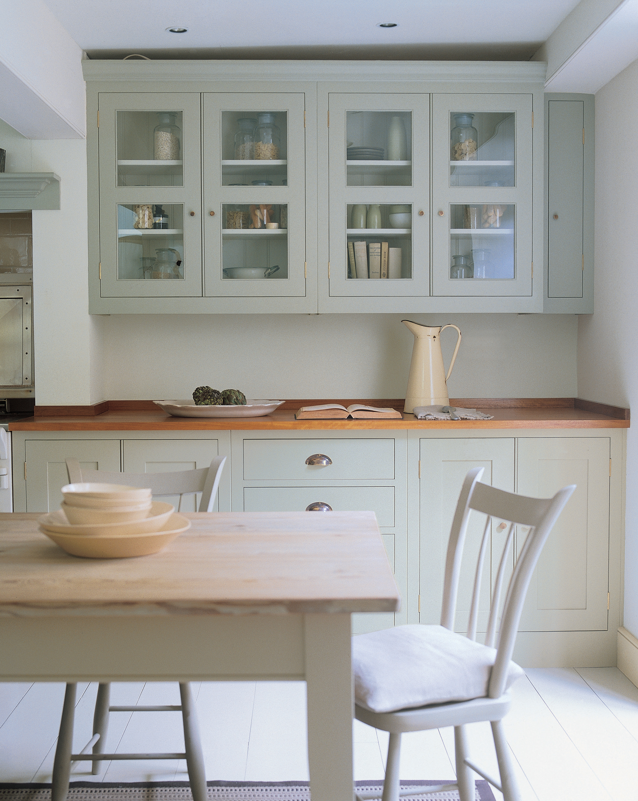 Interiors by Moyanne is proud to now carry Farrow and Ball paints. These colors are tried and true as Farrow and Ball is the oldest paint company in the world. They come in a variety of finishes including my favorite two—“Modern Emulsion,” a satin, and “Estate Eggshell,” a semi-gloss. Using these two finishes together in the same color gives you that tone-on-tone look.
Farrow and Ball paints have amazing texture, come premixed, and contain more titanium dioxide (more pigment) than most American paints, giving customers better wall coverage and refraction of light. This paint also has one of the lowest VOCs (volatile organic compounds) available.
One of the best things about Farrow and Ball is that it goes a bit further because of its composition. It works amazingly well and is easier to use than chalk paint on furniture.
As far as whites, Farrow and Ball “All White” and “Wevet” have a nice soft finish, but my personal favorite is “Strong White,” which has a hint of gray.
Moyanne Harding, Interiors by Moyanne
[section]
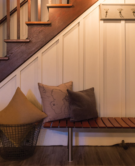
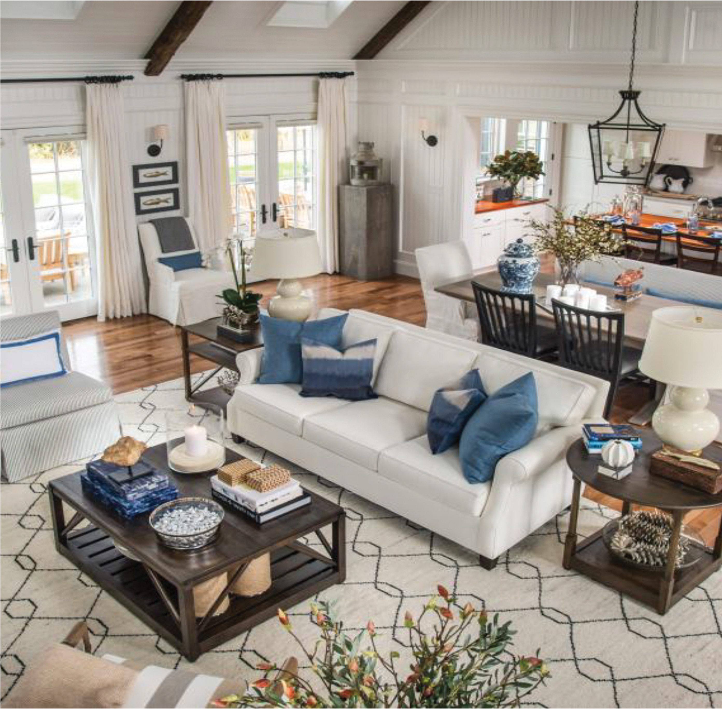 White paint for walls does seem to be the trend, though for our area it still seems to be about subtle variations of gray, gray/blue and gray/green wall colors. When you do see white walls, you also see a white window installation with white window treatments and furniture with pops of color added to the accessories. This could be in pillows, a trim on your curtain, or in floral arrangements. This “monochromatic” look creates a soothing atmosphere in which pops of color become more of the focus, enabling you to change out the brighter colors when desired. I tend to look at my client’s space and decide whether they need a white wall or variation of a subtle white with an undertone of cream or another shade altogether. I recommend that if you are doing a white or cream wall, add some interest with texture. That could be in molding, a paint technique, or even beadboard paneling. This helps to ground the space.
A color that I like to use is Sherwin-Williams White Flour (SW 7102). I would caution that although a white is neutral, there are many different undertones of white. White with pink, white with cream, white with grey and so on. You can buy a test can and paint a test area. I paint mine on foam board and look at the paint both during the day and night as color changes based on the amount of natural light and the type of lightbulbs you have in your light fixtures. All of these variations change the color of your paint. It is best to take your time as this saves on money and labor. Look for inspiration in your permanent pieces for the right shade of white, such as your cabinets, countertops and furniture. Compare your painted board to these areas to be sure that your “white” complements your permanent pieces.
Cindy Greer, Curtains, Blinds and Bath
[section]
I write this sitting in my library. Walls are White Dove by Benjamin Moore (OC-17) in a washable matte. Trim and millwork are also White Dove, but in a semi-gloss. I’m in heaven. Why? Because I’m surrounded by a blank canvas for color, texture, art and furniture. Every piece I add to the puzzle (drapery, art, rugs, upholstery) contrasts with the walls and makes a huge impact. Therefore, white rooms are often more carefully curated and refreshingly uncluttered. My other favorite whites include Benjamin Moore’s Simply White (OC-117) and Cloud White (OC-130).
Heather Zippel, SPACES by a little French
[section]
 Benjamin Moore’s color of the year is Simply White (OC-117). I’m using it right now in a downtown loft space in Lynchburg and love it! White paint brightens up spaces and helps give a room that desired fresh, airy feel. Many designers are pairing it with white upholstered pieces and letting artwork, throw pillows and rugs add color to the space.
There are a few things to remember when using a monochromatic color scheme. Consider adding a variety of textures. For example, white walls look great with a large jute rug, canvas-covered sofas, textural throw pillows and rustic end tables. Thanks to designers like HGTV’s Joanna Gaines, shiplap is in high demand. Painted white, this also adds texture to the room. And don’t be afraid to add color with throw pillows and art work. Do try to keep window treatments neutral, though. White walls will have more of an upkeep (think scuff marks, smudges, and little ones’ finger prints) so make sure you get a quality-grade paint in a durable finish that can be cleaned.
Kaycie LaGrone, Circa Studio Interiors
[section]
 If you’ve looked at a paint chart lately you may be surprised to find as many as 12 or more shades of white to consider. There is always the sharp bright white, while other shades may have tones of pink, gray, blue or yellow, which only serves to confuse the homeowner.
Personally, I have always preferred to use a shade of white for the trim and in many circumstances, an eggshell finish as opposed to a semi-gloss.
Recently, for Lynchburg’s Design House 2015, I choose Benjamin Moore Decorator’s White (OC-149) with an eggshell finish. I found the tone in this shade of white complimented the white scroll design in the wallpaper, while the eggshell finish offered an overall subtle look that complemented the wallpaper and the home. The color and the finish looked clean, clear and fresh. I loved the finished look.
I always encourage homeowners using any shade of white to take a sample home and compare it with the paint or wallpaper they are using. Light affects color and the lighting in the store can be entirely different than the lighting in the home.
Carolyn Mahone, Mahone & Sons Decorating Center
[section]
 I have two favorite whites that can be found locally at James T. Davis: Snowbank (545-1) by Pittsburgh Paints, and Melting Glacier by Davis Paint.
Whites can be tricky because of their hidden undertone. These two are easy go-tos that aren’t too yellow or too pink. They are beautiful on walls, trim or ceilings. I love using multiple tones of varying whites in a room (think cabinets/trim/wall/ceiling). This creates character and visual interest if done correctly. Depending on the use, a matte/eggshell finish is perfect for walls that call for easy touch-ups, and also works well to hide imperfections. For high-traffic areas, satin is perfect and super-durable for washing. For trim, semi-gloss and high gloss are great choices. My all-time favorite is eggshell if I must make a choice, but truly I like to layer sheen level in a room just as I do colors.
Haley Pavao, Pastiche Interiors
[section]
 I love color on the walls, but if I had to go white, Sherwin-Williams Dover White (SW 6385) is my go-to. White paint can have a gray undertone or a tan/gold undertone. I tend to stay away from the gray; the gold or tan undertones have a warm feeling and I like those the best. I love white furnishings that have been antiqued or whitewashed; this same technique can be applied to walls. Flat paint is easy to fix if you make a mark on it by painting over it. I prefer an eggshell finish, as it has a slight sheen and is easy to wipe clean. Low-luster and gloss will show every imperfection with a wall; however, it’s great for trim. As you know, someone else decides what is in or out and what is the newest trend—and I will say that of all the things you can change to stay current with a trend is paint. It is inexpensive enough that it can be changed often; you just have to be willing to move everything out of the way to get to the walls.
Kathy Potts, Decorating Den Interiors
[section]
 As much as I love color, I think that a good white is just like a perfect little black dress: flattering, timeless and great for any occasion! White doesn’t have to be that stock white contractors’-grade paint that you had to live with when you were renting. I rarely ever have clients ask for a white wall color that doesn’t have a slight hue in it. I’m partial to a soft white with a hint of blue/gray like Davis Perfection Semi-Gloss Paint 0600 Melting Glacier, which would be perfect for kitchen cabinets. The undertone is so subtle but complements other whites—such as white subway tile, marble or bright white trim—so nicely. Just like that little black dress, you can accessorize with any color you’d like!
Sarah Girten, James T. Davis
[section]
I like Super White from Benjamin Moore (OC-152). It’s a true “clean” bright white and everything looks good against this crisp white. For a warmer, creamier white, use Benjamin Moore’s Ivory White (CC-130). It’s flexible and works with any color that has more of a warm undertone. It’s also a good choice for trim color. Of course Simply White (OC-117), Benjamin Moore’s “Color of the Year,” is an excellent choice as well. I prefer Benjamin Moore’s eggshell finish, and for trim, use a semi-gloss finish.
Elizabeth Harrington, Studio H Home
[section]
 I like using Benjamin Moore’s Minced Onion (OC-128) on trim in a semi-gloss finish. Minced Onion appears green next to many other go-to whites, but it’s amazing when it goes up on the casings and moldings.
Beverly McCloskey, Beverly McCloskey Interiors
[section]
My go-to white for interior design is Shoji White by Sherwin-Williams (SW 7042). It is the perfect warm white with a gray undertone; it looks beautiful with wood or metal finishes. Shoji White is the perfect foundation for any style!
 In our farmhouse renovation, I chose this paint color for the entire main level. I have also used it in a variety of client spaces including master bedrooms and basements.
People always tell me “I can’t have white because I have kids!” But I disagree! You can have white walls as long as it has the right finish. Satin, also known as eggshell, is the best finish for walls. As for trim, moldings and doors, I choose high gloss. Both finishes are scrubbable and have the perfect light reflective value that adds visual dimension to any room. No matter your style, I challenge you to try white!
Katrina Morris, iheartdesign
[section]
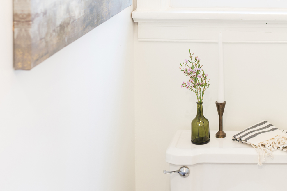 I’m a longtime fan of Benjamin Moore’s Decorator’s White (OC-149). But sometimes the convenience of a grab-and-go, premixed white can’t be beat. In those cases, I love Valspar Signature’s premixed 216344 White. It has good painting coverage and the color stays consistent in any light. I used Valspar White on the walls, ceiling, and moldings in this small full bath to create a fresh, airy space that is anything but sterile. The all-white palette allows the bath components to blend into the background, maximizing the feeling of space and creating a spa-like atmosphere in this petite bath.
Tera Auch, Tera Janelle Design
All White, Benjamin Moore, Beverly McCloskey Interiors, Circa Studio Interiors, Cloud White, Curtains Blinds and Bath, Davis Paint, Davis Perfection, Decorating Den Interiors, Decorator’s White, Dover White, eggshell, Estate Eggshell, Farrow and Ball, iheartdesign, Interiors by Moyanne, Ivory White, James T. Davis, Mahone & Sons Decorating Center, Melting Glacier, Minced Onion, Modern Emulsion, Pastiche Interiors, Pittsburgh Paints, satin, semi-gloss, Sherwin Williams, Shoji White, Simply White, Snowbank, SPACES by a little French, Strong White, Studio H Home, Super White, Tera Janelle Design, Valspar, Wevet, White Dove, White Flour, white paint