PRETTY IN PAINT

2024 Colors of the Year
The ocean of paint seems vast and limitless when perusing the palettes of 2024. It’s safe to say that this year’s colors encompass a variety of shades across the color wheel. Where years past have favored one side of the warm or cool spectrum, this year’s choices represent a healthy mix of both. A few common and notable trends can be seen across palettes of different paint brands. Aside from a handful of common themes, though, this year really is about embracing diversity in color and allowing many different possibilities. Having freedom to lean into any vibe under the sun at a time that celebrates many different design styles, is liberating. So if you want to splash your home with some new colors this year, there’s no other company to trust than painting service singapore.
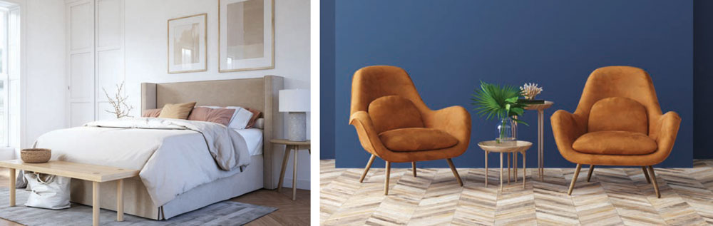
To recap, two years ago was all about green. Last year, berry colors took center stage, making us unable to look away. While these colors can still be found across all palettes, this year features different colors of emphasis. Blues have subtly drifted everywhere, like the tides of the ocean, a gentle breeze and a deep breath. All major paint brands offer a variety of blue shades, ranging from dark to light and cool to warm.
Another color trend of the moment is burnt orange. This color is showing up mainly in furniture, textiles and accents. However, some designers are featuring orange undertones as a main wall color, while pairing it with softer elements and light wood tones.
Creamy neutrals offer spaces a sense of minimalistic warmth that will make you feel right at home. Considering all the bright reds and pinks of last year, it’s no surprise that pink has now poured into neutrals as an undertone. Rich chocolates and bold blacks continue to ground our spaces, creating an anchor for organic natural looks, or otherwise creative or cerebral nooks in the home, like offices and dens.
Where many colors last year were saturated, bold standalones, palettes this year come across as more cohesive. Colors look like they can more easily be used in tandem in the same room, in ways that are monochromatic, complementary and analogous.
All in all, even though the “joy core” trend continues with many eye-popping colors, 2024 seems to be more about sustainable choices that will stand the test of time. There’s truly something for everyone, so let’s dive on into the ocean of color. The paint is fine!
 Pantone
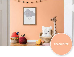
Peach Fuzz is Pantone’s choice for color of the year. Pure peach and peach undertones can be found in the palettes of all major paint brands, and as far as the Pantone Color Institute is concerned, peach is the head honcho of 2024. Described as a “velvety gentle peach,” this hue is said to evoke comfort, community, togetherness, warmth, nurturing, kindness and enrichment for the mind, body and soul.
Each year, Pantone takes into account trends across fashion, interior design, music, art, pop culture and psychology. According to the themes identified by the institute, the yearnings of 2024 are community togetherness, soft tenderness and a sense optimism — all things for which Peach Fuzz creates a cozy and inviting backdrop.
 Benjamin Moore
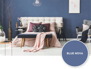
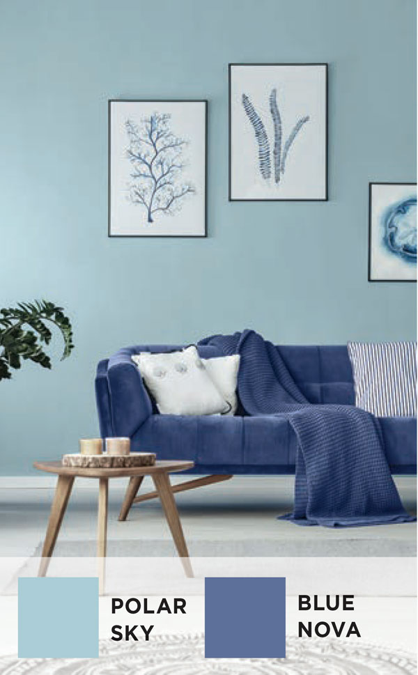
Setting the tone for blue hues, Benjamin Moore selected Blue Nova as its color of the year. Urging us to “elevate the everyday” and “expand horizons,” this color — a deep and dreamy blue — is intended to create “depth and intrigue,” yet balance it all with “an undercurrent of reassurance.”
Balance is an excellent term for the entire palette, as it includes a great many different colors of the rainbow and a nice blend of warm and cool tones. Other 2024 colors include White Dove, Pristine, Topaz, Teacup Rose, Honeybee, Regent Green, Antique Pewter, Polar Sky and Hazy Lilac. Benjamin Moore’s aim is for us to push the limits of creativity and possibility, while balancing our moods with soft saturation.
 Sherwin-Williams
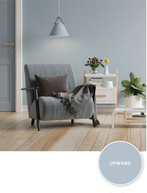
Sherwin-Williams also chose a blue as its color of the year. Upward, is a much lighter “breezy, blissful” blue, meant to evoke the feeling of slowing down and taking a deep breath. Similar to the vibe of a clear blue sky, when the mind is clear, we can feel contented and creative. Suggested colors for pairing with Upward, are both complementary and similar shades, including Snow Bound, Drift of Mist, Gale Force, Tricorn Black, Honeydew, Palm Leaf and Antiquarian Brown.
 PPG
PPG
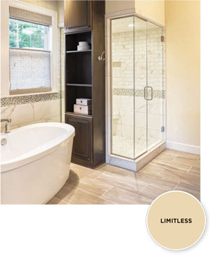
PPG Paints veered away from the blue trend for its color of the year. Yet the choice still emphasizes a notable theme. The PPG 2024 pick, Limitless, is a soft creamy neutral with peach undertones. Limitless embodies the “power of a primary color and the essence of a neutral.” Like Sherwin-Williams, PPG has rolled out three volumes of paints that honor different abstract themes. Limitless, considered a versatile neutral, is part of all three.
In Volume One, “calming, soothing and softening tints and tones are offset by warmed earthen and cooling twilight shades.” These include Persuasion, Focus, Blush Beige, Jam Session, Subdued, Craftsman Gold, Limitless, Pristine Petal, Aquamarine Dream, Night Rendezvous, Cajun Spice, Sweet Spiceberry, Tambico Brown, Cabin Fever and Dark As Night.
Volume Two is described as “a generous range of earthy and natural greens” partnered with “a bouquet of warm and floral hues.” This second group includes shades of Summer Rain, Graceful, Dusty Trail, Cappucino Bombe, Pine Garland, Caramelized Pecan, Purple Basil, Limitless, Still Searching, Soothing Sapphire, Blue Flame, Mallard Green, Do Not Disturb, Heart’s Content and Black Elegance.
Embracing defiance and reinvention, Volume Three honors the creativity of days gone by, with a nod to “Baroque, Renaissance, Art Deco and Pop Art” eras. The colors in this glamorous and historical lineup, are Daring Indigo, Parfait, Puturple, Emerald Pool, Napoleon, Roasted Pepper, Limitless, Catalina, Viva La Bleu, Merlot, Butterscotch Ripple, Turner’s Yellow, Siesta, Willow Herb and Black Walnut.
In general, PPG seeks to usher in a new era of creativity and change.
 Behr
Behr
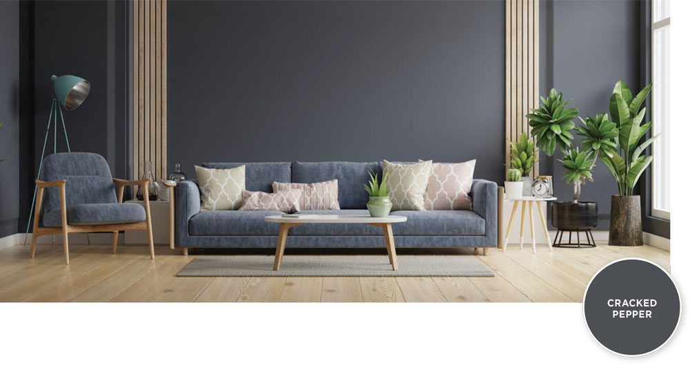
Behr has chosen a classic neutral as the color of the year. Its 2024 color, Cracked Pepper, is a versatile black, soft in nature and intended to enliven the senses. Behr offers several classic and bold neutrals in its 2024 palette, while also featuring similar trends of blues and burnt orange undertones that we’re seeing across all trending palettes. Behr’s goal was to offer a palette for any chosen style of design, by serving up hues that could be mainstays or popping accents in any room. Aside from Cracked Pepper, other featured colors include Whipped Cream, Weathered White, Even Better Beige, Malted, Tranquil Gray, Chic Taupe, Amber Brew, Riviera Beach, Orange Flambe, Offshore Mist, Provence Blue, Rumors, Laguna Blue and Mountain Olive.
 Color styling predictions
We’re likely to see the colors of 2024 come together in both classic and fresh ways.
 The top color theme this year will be “more is more.” Paint “drenching,” a hot trend, highlights spaces in which walls, molding, trim, window frames, door frames and possibly even ceilings are all painted the same color. When you walk into one of these rooms, it’s like a cocoon of color envelops you as you settle in.
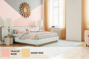
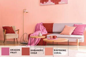 Similarly, monochromatic looks will feature different shades of a similar color ranging from light to dark (i.e., Polar Sky and Blue Nova). The analogous look will pair three colors that are right next to each other on the color wheel (i.e., Dragon Fruit, Habanero Chile and Ravishing Coral). Complementary pairings have always been a classic combo, and they will continue to be paired in a way that infuses the senses and creates balance. These big brand paint palettes contain complementary colors (i.e., Teacup Rose and Honeybee) that can be paired up for a wow factor that proves they just belong together.
 The colors of the year will show up as primary wall colors, paint accents, furniture, textiles and art. Wallpaper will continue to be heavily adorned on walls and may also show up in unexpected places like ceilings, wooden furniture and staircases.
So what’s the next step? Will you repaint your whole house? Will you simply choose a few new accessories? Either way, enjoy the process of picking the colors that inspire you. Dive into your own signature style with the colors that speak to your soul. ✦
2024 colors, blue hues, bold blacks, burnt orange, color wheel, creamy neutrals, monochromatic looks, peach fuzz, peach undertones, rich chocolates


