Hot Colors for 2021

PAINT CAN CONVEY ANY MOOD FOR ANY ROOM
When life feels uncertain, the best therapy is to command control over something small and rewarding. A manageable project is an excellent way to regain your sense of footing in an unpredictable world. A project involving color is a double whammy! Color has the power to change our moods. When a concrete action leads to an abstract reward like an improved mood, we achieve satisfaction at its finest. We reap the short-term gratification of task accomplishment, along with the long-term benefits of enjoyment.
 One of the easiest ways to affect mood in your home or office is through commercial painting. What mood would you like to achieve in 2021? Do you want to feel inspired? Calm? A whimsical sense of escape? Alert, yet Zen? We’ve done some research for you and compiled trending colors for the year ahead, along with their accompanying palettes, where they work best in the home, and the mood they are likely to invoke for you and your home’s inhabitants. Simply painting a room—or even a wall or two—can help you usher in an optimal sense of well-being.
The psychology of color
Has your mood ever changed seemingly on a dime without rhyme or reason? Maybe you simply moseyed in or out of a room.
 Color psychologist experts theorize that different hues can influence our feelings, thoughts, and even actions. You can easily recognize these effects if you close our eyes and visualize yourself walking through your own home room by room, reflect on the styles of loved ones’ abodes and the associated memories you have in those settings, or think back with nostalgia on a meaningful space from childhood. Identifying the vibes associated with different colors across the spectrum can help you set the mood in your current home and envision a future of desired states of mind.
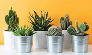 Bright colors like red, orange and yellow can actually make our hearts beat just a bit faster. Red can enliven a room with a sense of drama and warmth. Depth of the shade creates warm comfort, while brightness brings forth high energy, perfect for a family room or bonus game room. Yellow and orange can inspire both excitement and coziness depending on the shade. These colors are great for communal spaces where the goal is pleasure and togetherness, such a dining room or eat-in kitchen.
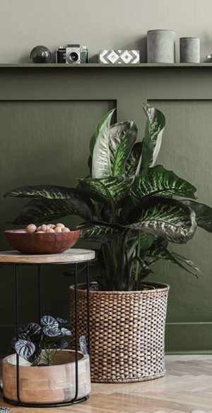
 Greens and blues remind us of nature and are thought to bring about a sense of harmony and serenity. Soothing and balanced, these colors work great in rooms of the house that encourage rest and relaxation. Bathrooms and bedrooms are the most traditional for greens and blues. Additionally, for those struggling with anxiety and racing thoughts, these colors can bring peace to the mind and offer a centered focus in the home office.
 Purple has been traditionally associated with royalty and luxurious living and is known for its ability to inspire artistic ability and spirituality. The shade is also popular with the kiddos. This color works beautifully in children’s bedrooms, imaginative playrooms, and spaces designated for creative hobbies like music, painting and writing.
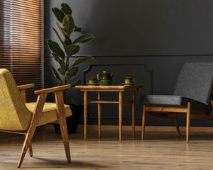
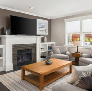
White and black are timeless colors, but you want to be sure to pair them with complementary accents, interesting accessories, and eye-catching art, or you risk creating a room that is drab (for the former) or overwhelming (for the latter). If paired well with other aesthetics, both of these classic colors can stand the test of time and make a room feel clean, fresh, modern and stylish. White and black work best in rooms where a lot of time is spent, such as living rooms and basements.
 Brown is a wonderful way to warm up a room and offer a sense of inviting coziness. Brown pairs well with wooden tones, leather, and natural accents. Boasting lots of versatility, brown can work well in essentially any room in the house.
For a color palette that is aesthetically pleasing and balanced (within reason and without limiting your creativity), consider following the classic interior design 60-30-10 rule. Choose a main color that will take up 60 percent of the room, in terms of paint, accessories and art. Choose a complementary color that supports but doesn’t compete with that color for another 30 percent of the room. Fill the final 10 percent with an accent color that contrasts and pairs pleasingly with the original color.
POPULAR COLORS OF 2021
Take a deep breath, because the overarching theme of 2021 is tranquility. This year’s vibes are entrenched in nature colors, homey comfort, and sunbaked hues. When you feast your eyes upon these palettes, you can’t help but feel a bit lighter due to the calming undertones.
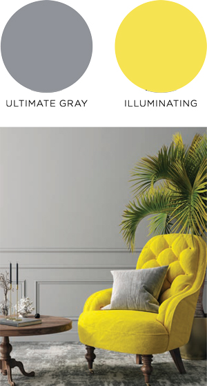 In December 2020, the color experts at PANTONE revealed their alwaysanticipated colors of the year—the combo of ULTIMATE GRAY and ILLUMINATING (a bright yellow). The marriage of these colors is a yin and yang of sorts, representing “deeper feelings of thoughtfulness with the promise of something sunny and friendly,” according to their website. This combination of calmness and hope can be seen across the board from all major paint brands.
BEHR hopes to “elevate your comfort zone” with the 21 colors that compile their special 2021 color trends palette. The idea here is to relax, maintain a subtle focus, and live with a sense of optimism. Very intentional with their inspired moods, BEHR includes not only the title of each shade, but also a helpful description of the mood that individual colors are designed to invoke.
These include: Smoky White (soft and serene), Almond Wisp (comfortable and adaptable), Sierra (warm and approachable), Modern Mocha (grounded and relatable), Jojoba (natural and rejuvenating), Wishful Green (nostalgic and fresh), Dayflower (reassuring and calm), Seaside Villa (subtle and elegant), Canyon Dusk (earthy and harmonious), Maple Glaze (hopeful and welcoming), Barnwood Gray (solid and relaxed), Caribe (engaging and steady), Voyage (soothing and spiritual), Jean Jacket Blue (timeless and peaceful), Cellini Gold (confident and inviting), Saffron Strands (fiery and festive), Kalahari Sunset (rich and expressive), Euphoric Magenta (gracious and creative), Nocturne Blue (stable and refined), Royal Orchard (restorative and secure), and Broadway (safe and resilient).
BEHR has made it simple for you. Decide what you wish for the vibe of a room based on personal preference and the room’s purpose, and choose the color that aligns with that vibe. Consider these ideas: Cellini Gold for the dining room, Almond Wisp for the bonus room, Maple Glaze for the guest room, and Jojoba for the bathroom. Any takers? The beauty is in the freedom. Your house, your choice. behr.com/consumer/ inspiration/2021-color-trends
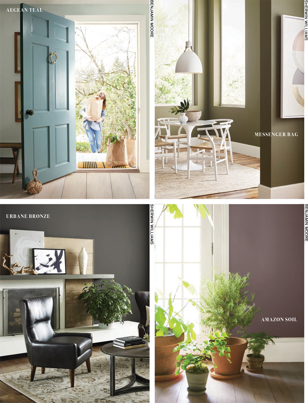
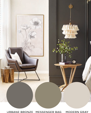 For a “down to earth” vibe, SHERWIN-WILLIAMS has introduced a color of the year that is dubbed “grounding, meditative, and serene.” URBANE BRONZE was selected for the hue’s ability to ground a room and pair well with other earthy tones like greens, warm neutrals, and bone whites. A monochrome palette includes similarly nature-inspired shades, such as MODERN GRAY and MESSENGER BAG.
Earth tones in general go great in rooms designated for a calm yet focused state of mind. They also make excellent accent colors. A mantel in a den or library, a dressing room, or even the primary shade of a bedroom are ideal for URBANE BRONZE, especially if these spaces already incorporate wood finishes, metallic features, or accents made of stone. swcolorforecast.com
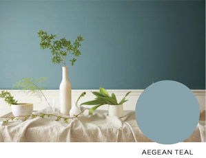 Keeping with the calm theme that seems to be a pattern across the board, AEGEAN TEAL is BENJAMIN MOORE’S choice for their color of the year. Noted for its qualities of “intrigue, balance, and soothing,” Aegean Teal encourages spectators to “settle in” and make themselves at home. This cozy, inviting quality is embodied by the other 11 colors in the 2021 palette line-up: Gray Cashmere, Atrium White, Muslin, Foggy Morning, Amazon Soil, Silhouette, Kingsport Gray, Beacon Hill Damask, Chestertown Buff, Potters Clay and Rosy Peach.
Where do these colors look best? Think of the places associated with creature comforts in your life. What areas do you associate with warmth and joy? A classic cupboard? An eat-in kitchen with an accent wall? A fireplace frame? A living room with large windows that invite you to bask in the afternoon sun, while you curl up on the couch with a good book? These are all great places to start. benjaminmoore.com/en-us/color-overview/colorpalettes/ color-of-the-year-2021
 To round out all the feels, PPG PAINTS brings us balance through human connection, kindness and compassion with their 2021 palette. Combining warmth and calmness, PPG’s palette encourages us to transcend our current emotional limitations. Colors consist of: Big Cypress, Wheat Sheaf, Winter Peach, Heliotrope, Stone Quarry, Silver Leaf, Autumn Glow, Misty Aqua, Irradiant Iris, Salal Leaves, Midsummer’s Dream, Canyon Blue, Delicate White and Transcend. Each color has a visually specific distinction and purpose. Connect with loved ones in your Autumn Glow dining room. Sink into a relaxing bubble bath in your Irradiant Iris bathroom. Create art in your Winter Peach studio. Snooze the night away in your Silver Leaf bedroom of serenity. ppgpaints.com/color/color-collections
Can we get a drum roll for some local colors? JAMES T. DAVIS PAINT AND DESIGN CENTER in Lynchburg has unveiled an inspired-by-nature paint palette that is bold, dynamic and playful, yet classic. Colors include: I’m a Local (yellow), Subway (deep bronze), Casa De Oro (orange), Mystic Fog (white), Metro (gray), and Blue Depths (blue).
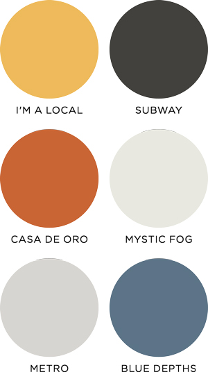 With such a wide variety of mood-enhancing shades, here’s an idea for some 2021 color therapy: Why not try a different spin on the 60-30-10 rule—not with the décor of a single room, but with emotional states as they relate to daily life in your home? To explore this idea, ask yourself what is your favorite mood? What would you like to feel, perhaps not daily, but in small spurts? If you wish to embrace playfulness for your family, consider I’m a Local for that 60 percent of your home that includes the living room, perhaps a sunroom, and a powder room. These are likely places where many waking hours are spent. But what about when it’s time to slip into slumber? Head to your Mystic Fog master bedroom and decompress from a day of sensory overstimulation. Clear the mind of clutter and thought loops and slide into a dream or simply relax on a Saturday afternoon for that 30 percent period of time. How about when you want to feel steady, anchored and comfortable? Sneak away to the Subway den, for a quick escape as you binge the new Netflix series or flip through a favorite magazine. This would be ideal for a 10 percent space intended for rejuvenation or a mental reset. jamestdavis.com/colors
Whatever you choose to color your world in 2021, you can relax into fresh colors and projects that honor calm, creativity and freedom of choice. Cheers to tranquility! ✦
2021, AEGEAN TEAL, black, blues, Bright colors, brown, color palette, Color psychologist, color trends palette, greens, Hot Colors, ILLUMINATING, MESSENGER BAG, MODERN GRAY, orange, paint color, POPULAR COLORS, Purple, Red, ULTIMATE GRAY, URBANE BRONZE, white, Yellow